Designing for dark mode is not just about inverting colors. If you simply swap white for black, you will likely destroy the readability of your site. Successful website design Nigeria depends on managing contrast ratios carefully. You need to adapt your brand guidelines to function in two different light environments.
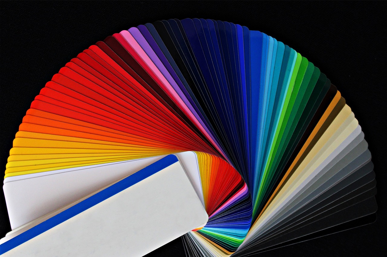
Many founders try to use their existing brand colors exactly as they are on a dark background. This often results in colors that look muddy or hard to read. You must adjust the lightness and saturation of your palette. A vibrant blue that pops on a white page will often be far too intense against a dark background.
Adjusting your color hierarchy for website design Nigeria
Your primary goal is to ensure text remains legible without straining the user's eyes. Never use pure white text on a pure black background. This high contrast can cause halation, which makes text look blurry. Aim for a light grey for your body text instead.
You should audit your current color palette before you start. Identify which colors are purely decorative and which ones are functional, like error messages or links. Decorative elements can often be darkened, while functional elements need to remain bright enough to pass accessibility checks.
If you are struggling to make your brand identity translate well, our graphic design servicesPhoto by Goumbik on Pixabay can help you map out a secondary set of theme-compliant colors. This ensures your brand looks professional regardless of the user's system preferences.
Applying depth without using shadows
In light mode, we use drop shadows to indicate that an element is floating above the page. In dark mode, shadows are invisible. You need a new way to show depth and hierarchy. Use lighter shades of your background color to create elevation.
A card or a modal window should have a background color that is slightly lighter than the main page background. This subtle shift tells the eye that the element sits on top. Use borders sparingly or opt for thin, lighter-colored lines to define the edges of these interactive areas.
This approach prevents your interface from looking like a flat, confusing blob. A clear hierarchy helps users find information quickly, which is central to effective website design Nigeria. Think of your interface as a stack of paper where each layer is a slightly different shade of dark grey.
Handling brand logos and imagery
Photo by avantrend on Pixabay
Your logo is the most identifiable part of your business. If your logo has a dark fill, it will vanish on a dark background. You should keep at least two versions of your logo ready for development. One is the original, and the other is a high-contrast or inverted version for dark mode.
Avoid full-color photos that feel too bright or busy. If you must use images, consider applying a dark overlay or a slight desaturation to prevent them from clashing with the dark theme. This keeps the focus on the content rather than the distracting brightness of the image.
When you are ready to implement these changes, you may need a technical review. If your current site is not built for flexibility, our technology consulting experts can show you how to structure your code to support multiple themes properly.
Testing contrast for better website design Nigeria
You can use automated tools to check your contrast ratios, but your eyes are the final test. Open your design on a phone in a dark room. Check if the buttons feel like they are popping out or sinking in. Make sure your call-to-action buttons maintain their prominence.
Many developers make the mistake of using standard blue for all links. On a dark background, this can look neon or harsh. Try adjusting the shade to a softer, pastel version of your brand color. This satisfies the requirement for a link color while keeping the overall aesthetic balanced and calm.
Practical design is about making choices that serve the user. A dark mode that is hard to read is a failure, no matter how good it looks in a portfolio. Stick to these core principles to keep your site functional, clean, and on-brand.
Frequently asked questions
Should every website have a dark mode?
Not necessarily. Dark mode is helpful for reading-heavy sites or apps used at night. If your audience spends long hours on your site, it reduces eye strain. However, if your brand is built on a specific light-based aesthetic or your site is simple, you might not need to add it.
What is the most common mistake in dark mode design?
The most common error is using pure black for backgrounds. Pure black can make text look like it is vibrating or floating. Using dark greys for surfaces and reserving black for borders or deep shadows usually looks more natural and prevents contrast issues for most users.
How do I handle brand colors that don't show up on dark backgrounds?
You should create a secondary palette. If your primary brand color is a dark blue, it will disappear against a black background. Use a lighter, desaturated version of that same hue to keep your brand identity intact while ensuring the text or button remains clearly visible and readable.
Effective website design Nigeria businesses rely on is far more than choosing pretty colors or a clean template. It is the primary tool for communicating trust to your cu...